New day, New life, New site
Blog > New day, New life, New site
Let’s see… Let’s let the nostalgia river flow and see how to ‘retrofit’ these pages into old school
(copy from the home page)
I first used [this blog] somewhat as a portfolio, with material design, responsiveness, and what not, some js with stuff. It was cool and fun making it, and it served it purpose for a while (being learning something with somewhat a purpose). After coming back a few times, I thought to 'renovate' it with a 'brand new' look, again, to have some fun and make it fun to browse. After all, nice links, filling bars, parallax images, responsiveness look smooth and all, but lack personality. They are no fun to watch if the style is pretty much always the same, innit?
So I thought of something, more personal, more vibrant, more fun! And, in a wave of nostalgia, what better design would it be if not the Late 90s/early 2ks websites, with less colors to chose from, less fonts, more gifs, more fun.
Version 1.0
Didn’t take any pictures, whopsie!

Version 2.0
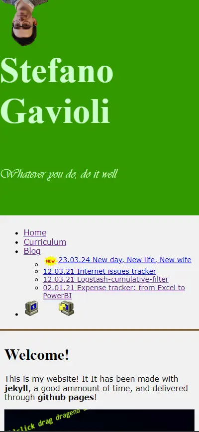
This is the home page after first revision. I know it isn’t supposed to be responsive, but it’s easier to have it done in css rather than build two different websites as it used to be, like a “m” subdomain.
Web

Mobile

Sources
I’ve extensively looked in the web (duh) for inspiration. Webdesignmuseums.org has been of great help, same as the WayBack Machine of Internet Archive. Last but not least, I have used gifcities to browse for wonderful in-style gifs to put everywhere.


 06.01.26 Are we amusing ourselves to death? Even more?

